In this class, I developed foundational design skills and explored creative problem-solving through two major projects.
Typography Brochure:
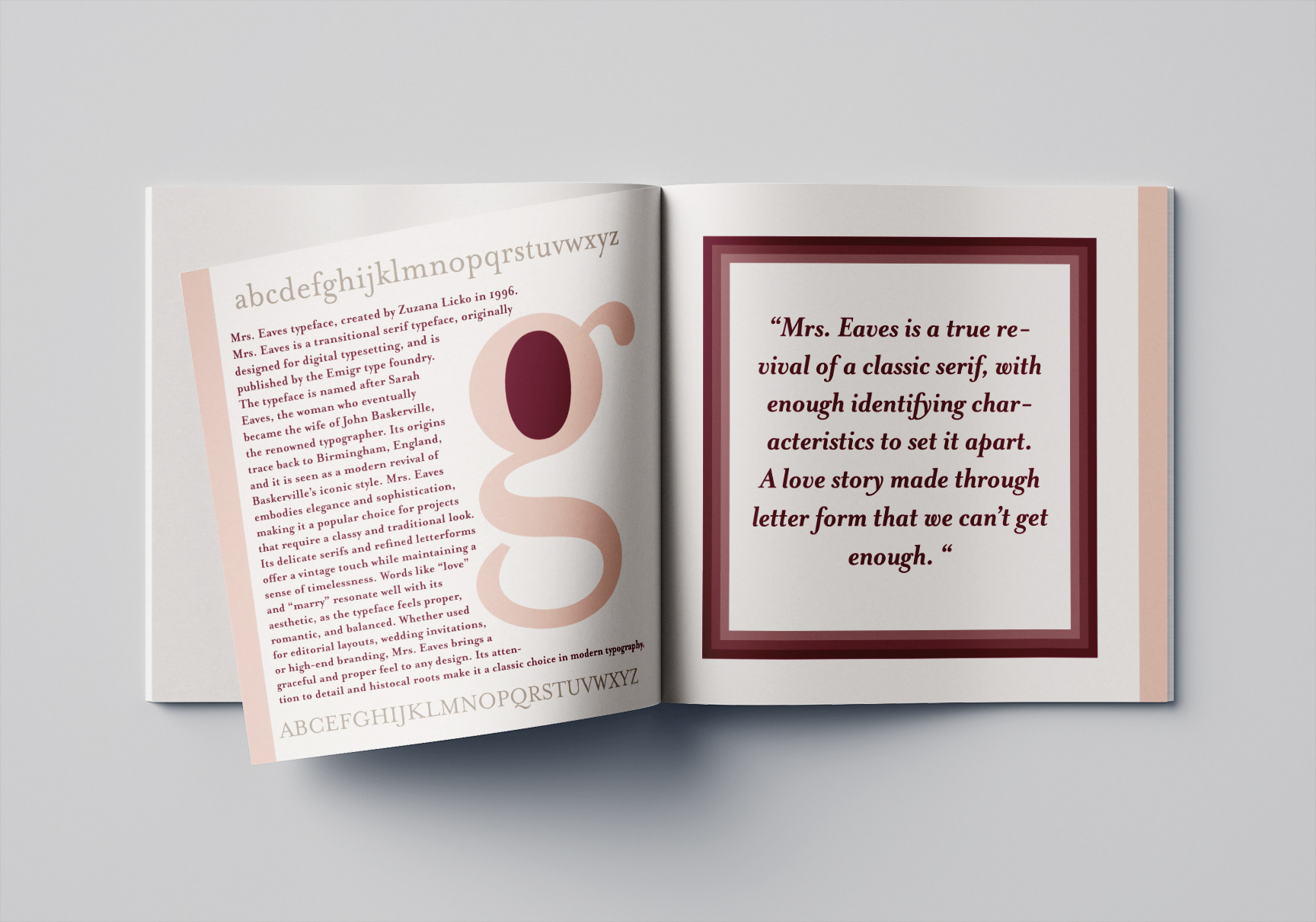
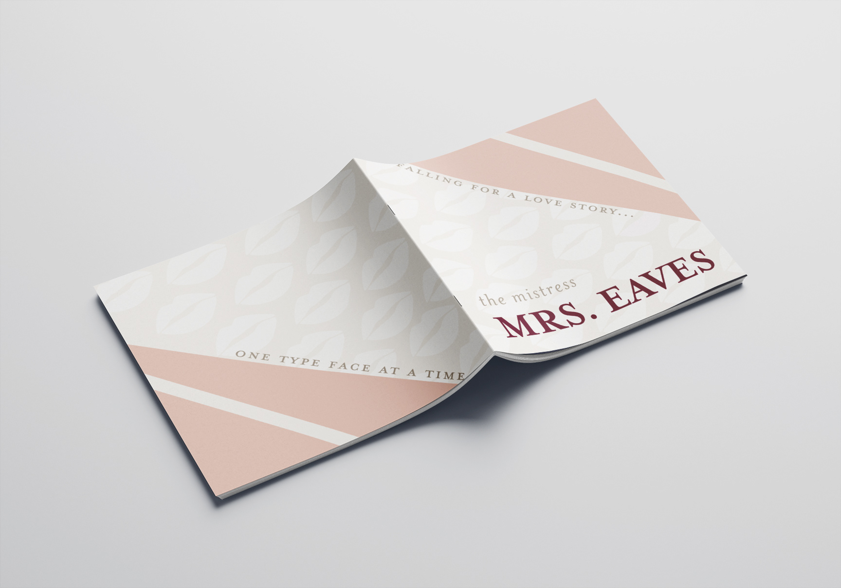
We were tasked with choosing a typeface and designing a brochure that showcased its history, personality, and design potential. I chose Mrs. Eaves — a serif with a rich and dramatic backstory that made the design process all the more exciting. I leaned into its classic elegance while experimenting with bold layouts and typographic contrast.
We were tasked with choosing a typeface and designing a brochure that showcased its history, personality, and design potential. I chose Mrs. Eaves — a serif with a rich and dramatic backstory that made the design process all the more exciting. I leaned into its classic elegance while experimenting with bold layouts and typographic contrast.
Brand Identity & Packaging – Pop & Pour:
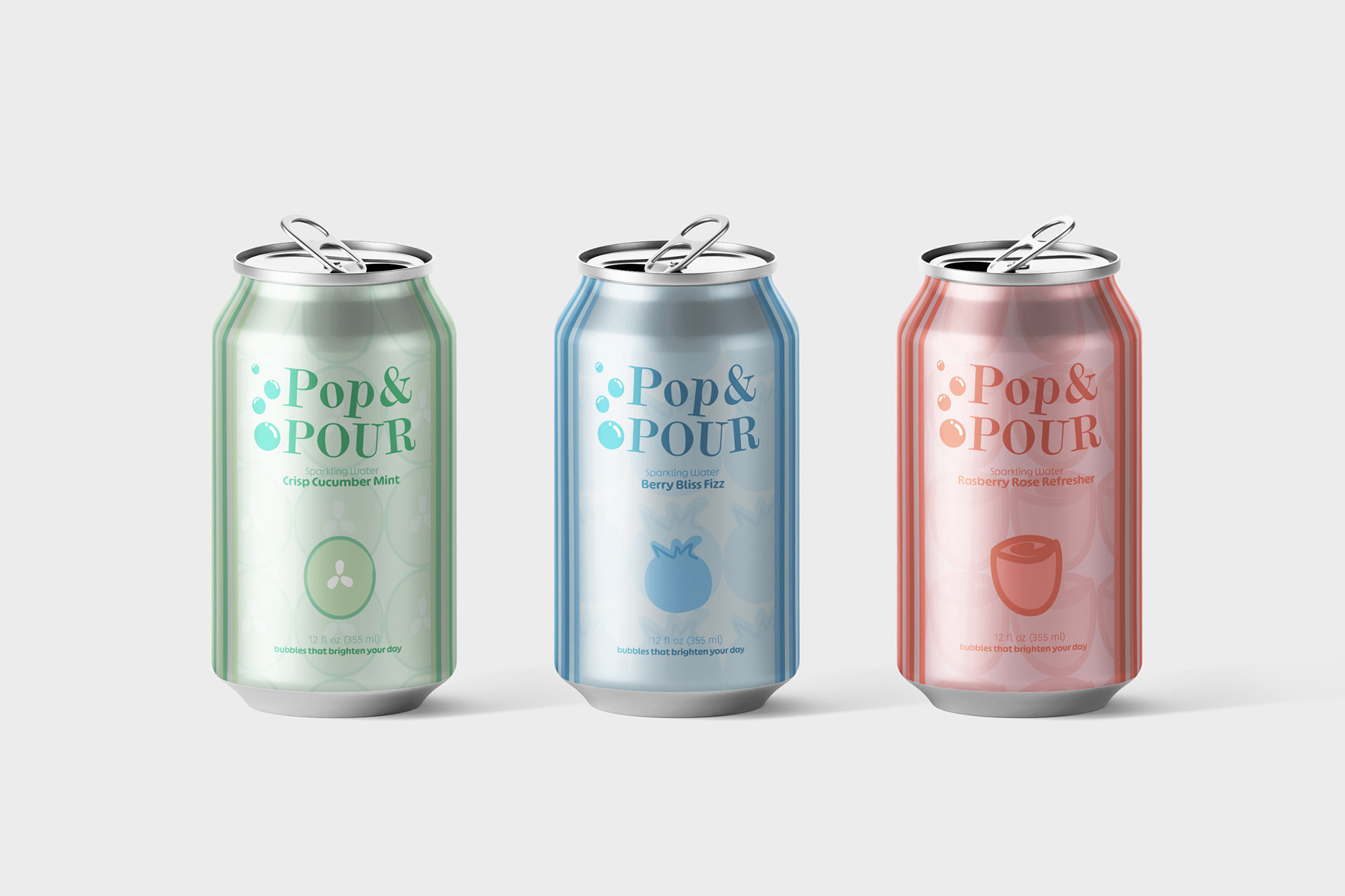
Our second project involved creating mockups for a fictional sparkling water brand. This is where Pop & Pour was born — a fun, vibrant concept that blends playful visuals with clean branding. I designed everything from the logo and color palette to the can packaging, exploring how design influences consumer perception.
Our second project involved creating mockups for a fictional sparkling water brand. This is where Pop & Pour was born — a fun, vibrant concept that blends playful visuals with clean branding. I designed everything from the logo and color palette to the can packaging, exploring how design influences consumer perception.